
Making the World of Wine More Approachable
A UX case study on helping young wine drinkers shop smarter and sip confidently

Let’s SIP
SIP is a mobile app designed to make wine exploration more accessible, especially for young and novice wine drinkers. Users simply scan a bottle to get expert-backed insights, recommendations tailored to their taste, and a peek into what their friends are sipping.
The Problem:
Young consumers are increasingly curious about wine, yet face these challenges:
Intimidation due to a lack of knowledge
Too many choices with unclear differences
No accessible, personalized guidance
“Wine is something I want to get into, but I don’t know where to start.” - User interview
The Goal:
Design a mobile experience that empowers new wine drinkers to:
Discover wines aligned with their preferences
Learn and explore with confidence
Engage in a social community of like-minded sippers
My Role
As the UX Designer and Researcher on SIP, I took the project from concept to high-fidelity prototype by owning the end-to-end product design process.
My focus was to transform a broad idea into a validated, intuitive mobile experience for new wine drinkers.
/01 Synthesizing user research to uncover core pain points
/02 Defining product goals, feature requirements, and user needs
/03 Mapping key user journeys for discovery, scanning, and reviews
/04 Designing wireframes and building interactive prototypes in Figma
/05 Rapidly iterating based on user testing and team feedback
Research
To better understand the landscape of digital experiences in the beverage space, I conducted a comparative analysis of leading mobile applications focused on drink exploration and discovery. These platforms offered a variety of features, including bottle scanning, expert reviews, tasting notes, personalized recommendations, and community-driven interactions like journaling and social feeds. Some even enabled users to purchase products directly through the app.
From this research, it became clear that scanning functionality and social engagement were especially compelling for users, offering instant access to trusted information and a sense of belonging. However, I also identified a notable gap: the lack of personalized guidance tailored to individual preferences, particularly for those new to the space. This insight reinforced our decision to design SIP as a community-oriented, user-personalized platform that empowers users to explore wine with more confidence and connection.
To better understand user needs and behaviors, I conducted interviews and usability tests with target users before, during, and after interacting with the SIP prototype. Before testing, I explored participants’ existing knowledge of wine, their confidence levels when shopping, and the typical challenges they face when selecting a bottle. Many described the wine aisle as overwhelming and admitted to choosing wines based on label design or price rather than taste preferences.
During testing, users were guided through three key experiences: setting up a profile with taste preferences, scanning a wine bottle to access information, and writing a review after tasting. These sessions helped evaluate the clarity and usability of core flows—particularly around onboarding and bottle interaction.
After testing, I followed up with questions about their overall impressions of the app. I asked whether SIP made wine feel more approachable and if they would use it while shopping in the future. One insightful takeaway came from a participant who said, “The scanner was easy, but I wanted more context on why this wine matched my preferences.” This feedback shaped further refinements in how we surface personalized recommendations and explain matching logic to users.
From Insight to Interaction
Designing SIP was an iterative journey grounded in user insight and guided by rapid feedback loops. After gathering research and identifying the key pain points young wine shoppers experience, I translated those insights into core product requirements and user flows. The design process focused on building intuitive pathways for discovery, learning, and community engagement, all centered around the act of scanning a bottle.
Research to Design
Based on findings from user interviews and competitive analysis, I mapped out the primary flows SIP would need to succeed:
Onboarding with preferences to tailor the experience from the start
A bottle scanning feature for immediate information access
A home feed combining personalized recommendations and social updates
A cellar and profile for users to track their wine journey
Wireframes were developed in Figma and quickly evolved into interactive high-fidelity prototypes. I prioritized clarity, minimal friction, and a sense of approachability throughout the interface, especially during onboarding and scan results.
The Solution - Sipping Made Easy


Home
Personalized wine recommendations
Feed of friend reviews and sips
Quick access to Scan & Search

View Sipped / Saved bottles
Personalized bottle suggestions
Taste profile summary
Set wine taste preferences
Preferences fuel recommendation engine
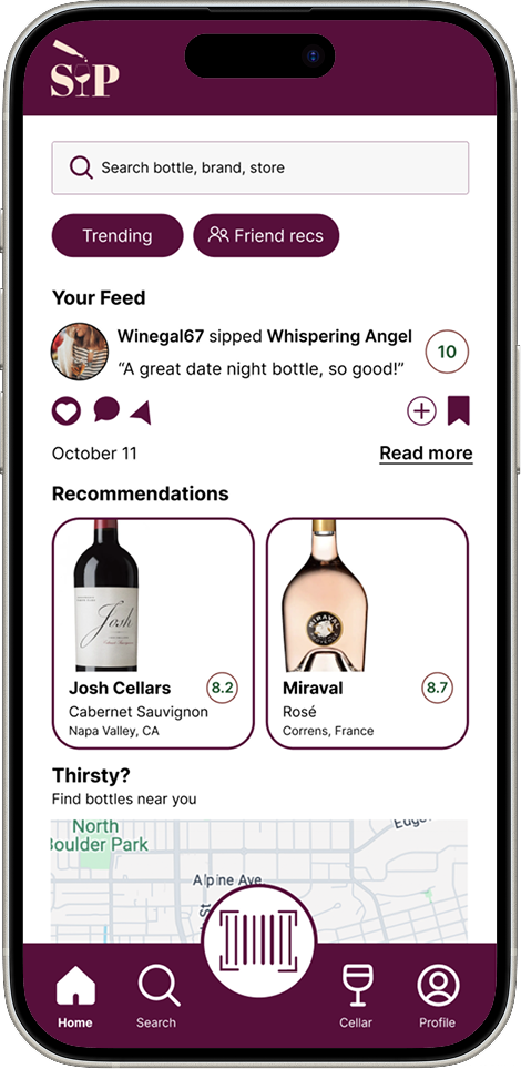
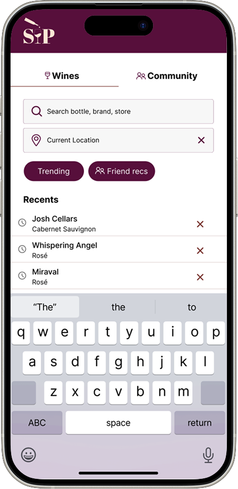
Search
Explore wines by name, location, or recommendation type
Filters for trending wines, friends’ picks, and pairings
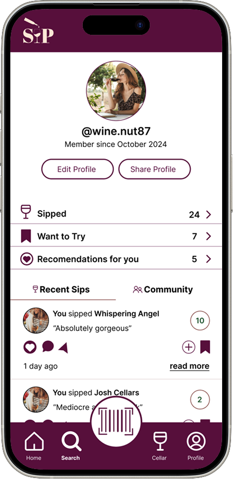
Profile
On-boarding
Scan
One-scan access to bottle data
Pulls from Global Wine Database
Tailored feedback based on preferences
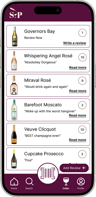
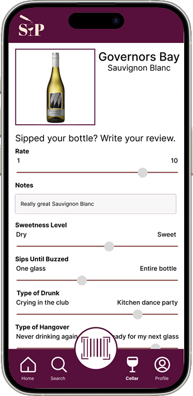
Cellar
Digital journal of wines tried
See others’ takes on the same bottle
Add personal reviews
Testing & Iteration
With a working prototype in hand, I led usability sessions that highlighted both strengths and opportunities. To structure improvements, I conducted an After Action Review at each stage:
What we expected to happen: Users would easily complete onboarding and scanning, then explore recommendations.
What actually happened: While the scanner flow performed well, many users skipped or rushed through preference setup.
Why it happened: Users didn’t immediately understand how preferences influenced their experience.
What we did next: We added microcopy and tooltips to clarify the purpose of each onboarding step and visually emphasized the scanner feature on the home screen.
Continuous Feedback in Action
Team feedback was integrated in real-time through collaborative design reviews, enabling quick refinements to layout, feature hierarchy, and interaction patterns. We also strengthened visual consistency by referencing our brand system, ensuring the app felt fresh, modern, and welcoming.
Ultimately, each iteration brought SIP closer to being not just a tool, but a trusted companion for wine discovery, designed with empathy, informed by users, and built to demystify an often intimidating world.